MoneyWorks Manual
Element types
To add an element to the form:
- Click the Add Control button.
A new Untitled button will appear on the form. You can drag the element to where ever you want it positioned, and resize it by dragging its resize box at the bottom-right corner.
To change the type of the element:
- Double-click the element
The Item Properties window will open.
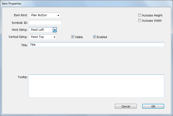
The type, ID and other details about the element are specified here.
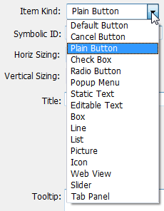
Item kind: The type of the item (button, pop-up menu, editable text etc. These are discussed in more detail below.
Symbolic ID: The ID of the item. Each item that you want to access from a script will need an ID. The ID is text and must also be unique for that form.
Horiz Sizing: How the location and size of the element will change if the window is widened by user. Options are Fixed Left, Fixed Right and Elastic.
Vertical Sizing: How the vertical location and size of the element will change if the height of the window is changed by the user. Options are Fixed Top, Fixed Bottom and Elastic.
Autosize Height:
Autosize Width:
Visible: If this is off, the item will not be visible by default when the form is displayed. Enabling can also be managed programmatically using the SetFieldVisibility() function.
Enabled: If this is off, the item will not be enabled by default when the form is displayed (you can't type into a disabled text field, or select from a disabled pop-up menu). Visibility can also be managed programmatically using the SetFieldEnabling() function.
Title: The title of the item (for example, the name that appears on a button, or the label next to a pop-up menu).
Text: The text for static and edit text items. This can also be set programmatically using the SetFieldValue() function.
Tooltip: Help text that will be displayed if the mouse hovers over the item.
Group ID: Radio buttons with the same Group ID will act as one radion button set (so turning one on will turn another off).
Frame/Fill: For boxes allows you to select a fill (white, instead of the default grey) and frame (grey or none), and for lines just the line colour (any colour as long as it is grey).
Image Name: For pictures, the name of the image to be displayed. This can also be set programmatically using the LoadPicture() function
URL: For web views, the URL of the web page to display. This can also be set set programmically using the LoadHTMLInWebView() and LoadURLInWebView() functions.
Tabs: For panels with tabs, the tab labels separated by a semi-colon (for example “First Tab;Middle Tab;Last Tab”).