MoneyWorks Manual
Chart 
Use the Chart part to display a simple chart or graph in your report. This will take up the full width of the page; smaller charts can be created within cells.
Table Text: The data to use to generate the chart. This needs to be a table of tab-delimited values, with each row separated by a new line. The first row contains the column headings (which will constitute the key on the chart—if all values are empty, no key will be produced), the first column contains the x-axis headings. For textual data, the tab character can be represented as “\t”, and the newline as “\n”.Thus the following table:
| Bloggs | Jones | White | |
| Jan | 33 | 54 | 77 |
| Feb | 66 | 78 | 56 |
| Mar | 87 | 6 | 56 |
| Apr | 56 | 45 | 87 |
could be represented by the following in the Table Text field:
="tBLOGGS\tJONES\tWHITE\nJan\t33\t54\t77\nFeb\t66\t78\t56\n
    Mar\t87\t6\t56\nApr\t56\t45\t87\n"
In practice you will probably want to build your table at report time based on the data in your MoneyWorks file. Useful functions for doing this are Analyse, Dice, Head, Slice, Sort, TableFind, TableAccumulate, Transpose. You can also use the For Each ... End For loop to step through selected records and build up the table text in a cell variable.
Type: Sets the chart type. The diagram below has examples based on above data
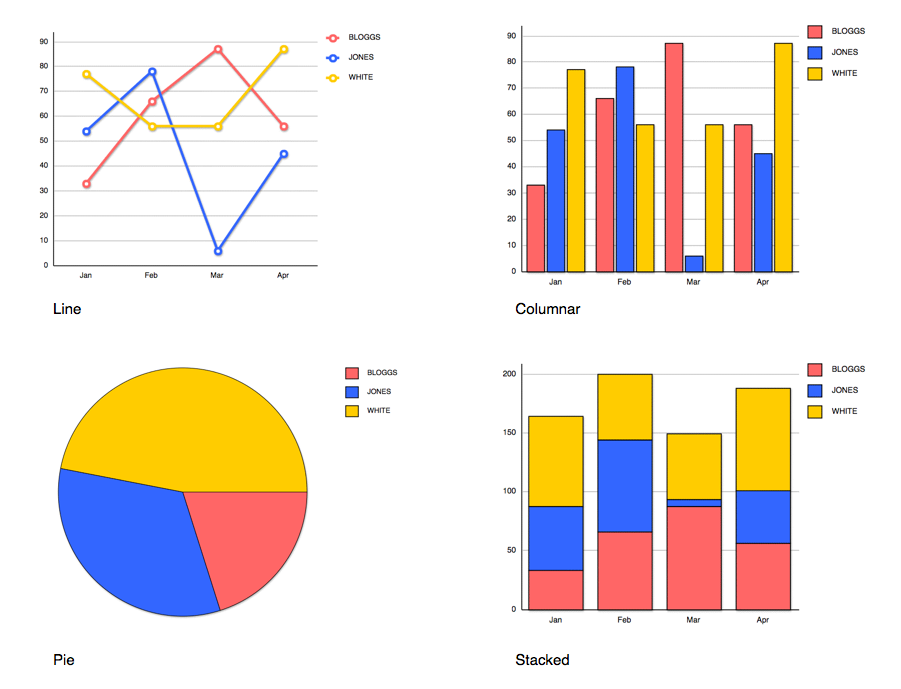
Note that Pie graphs only reasonably display a single column of data. The above was done by using the Head function to take the first two rows (the first being a heading), then converting this into a column using the Transpose function.