MoneyWorks Manual
Item Types
Default Button
The default button (activated when enter/return is pressed). By default, this will be titled “OK” with an ID of “B_OK”.
When clicked, a Validate message is sent to the window, followed by an After message (provided the Validate returned true). For User2 table records, you should save any changes to the record in the After handler. For overlays to standard forms, you can update tagged fields in the UserText from the Validate handler (MoneyWorks itself will save the record before your After handler is called).
The Cancel Button
The Cancel button closes the window without sending a Validate message (so changes are not saved). By default this will be titled “Cancel” and the ID is “B_CANCEL”.
Pressing the esc key is the same as clicking on the Cancel button.
Plain Button
A button for you own use to activate some procedure or open another window. When the button is clicked an itemHit() message is sent to the window.
Check Box
A check box. When clicked an itemHit() message is sent to the window, or you can read/set the value using the getFieldValue() and setFieldValue() functions respectively.
Radio Button
Radio buttons are assigned to a group id (using the Group ID field), so that when one button in the group is turned on, the previously set button will be turned off. Like check boxes, an itemHit() message is sent to the window when the button is clicked, or the value can be read/set using the getFieldValue() and setFieldValue() functions respectively.
Pop-up menu
For static popup menus, the allowable values should be set in the Text field, each value separated by a semi-colon (e.g. “Option A; Option B; Options C”). Again an itemHit() message is sent to the window when the popup is selected, and the value can be read/set using the getFieldValue() and setFieldValue() functions respectively.
Any item name beginning with a “(” will be disabled, and you can use “(-” for a separator item.
If you want a dynamic pop-up menu (one whose contents changes depending on the context) use the AppendPopupItems() function to add items, and DeletePopupItems() to clear the menu.
Static text
This is for text items on the window, such as labels and instructions, that cannot be altered by the user. Using the text alignment and adornment tools, the text can be large or small, plain, bold or italic. And, just like a certain automobile, you can have the text in any colour provided it is black.
Because static text cannot be altered by the user, no itemHit() message is sent if it is clicked on. Although the user cannot change the text, you can change it programmatically using the setFieldValue() function. To do this you will need to give it an ID.
Editable text
Editable text items are essentially fields into which the user can enter text. As such, whenever a character is entered into an edit text field, an itemHit() message is sent. Similarly when the user tabs out of the field, a validateField() message is sent, enabling you to validate the entered data.
By default, an edit field's length is limited to 255 characters.
You can set (or prepend) metasymbols inside angle brackets in the default text of field to change its behaviour:
<SBAR>      The text field will have a scroll bar
<SBA2>      The text field will be scrollable and support tabs, with monospaced font
<LEN=nnn>   Specifies a maximum length in bytes
<PASS>      The field hides input with bullets (password field)
<CODE>      The field will autocapitalise and not allow spaces or wildcards
<IDEN>      The field will not allow spaces or wildcards
<ARTN>      The field will allow newlines to be typed with option-Return/Ctrl-Return
<READ>      The field will not allow typing, but will be selectable for copying (9.0.3 and later)
<TIME>      The field will not generate an ItemHit until the user pauses typing
You can include several metasymbols inside the same set of angle brackets. E.g. <SBARARTNLEN=1000>
Box
Line
You can select line and box styles from the Frame and Fill popups. Boxes can have an optional title.
List
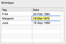
A List is a set of rows and columns. The structure of the list (the columns) and it’s contents are defined programmatically when the list is created, using either the InsertListObject() or the InsertEditListObject() function.
The contents of a list can be got by using the GetListContents() function, and replaced by using the SetListContents() function.
Clicking on a list can also generate an itemHit() message, the Clicks() function can be used to determine if a double-click occurred.
Note: To create full list windows, like the Transaction or Names list, use the ModalListWindow(), or CreateListWindow() functions.
Picture
A Picture element will display an image.
The name of the picture can be specified in the Img Name field. The name is of the form keyword:identifier, structured as follows:
| KeyWord | Identifier | Example |
| product | Product code | product:BA100 |
| transaction | sequencenumber | transaction:1001 |
| file | path | file:/Users/fred/documents/pictures/image.png |
| builtin | name of builtin image | builtin:enquiry |
| logo | company logo | builtin:logo |
Pictures can also be loaded programmatically by using the LoadPicture() function.
Web Viewer
A Web Viewer element is for viewing websites (or html), just a like a browser.
You can hard-wire a URL or html into the URL box, or load it dynamically using either the LoadURLInWebView() or LoadHTMLInWebView() function respectively.
Tab Panel
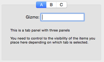
A Tab Panel is a tabbed area on the window as shown.
The tab names are specified in the Tabs field, with each name, including the last, being followed by a semi-colon (so in the example, the names were entered as “A;B;C;”).
When a tab is clicked upon, an itemHit() message is sent to the tab panel. You can determine which tab by using getFieldValue(), which returns the name of the tab (“A”, “B” or “C” in the example). Note that you will need to programmatically set the visibility of the items on the tab depending on which tab is current, for example.
    on Load
        createWindow("Sample_Window")
    end

    on itemhit:sample_window:tab_A(w, i)
       let tabname = getFieldValue(w, i)
       setFieldVisibility(w, "S_Gizmo", tabName = "A")
       setFieldVisibility(w, "E_Gizmo", tabName = "A")
       setFieldVisibility(w, "E_FieldonB", tabName = "B")
    end